Julie Blanc (EUR ArTeC / Université Paris 8 - EA349 / EnsadLab)
{ @media print }
A (bright) future without desktop publishing
</>
About Design, Paris College of Art, March 14th, 2023
Back to the eighties, do you know how books were made ? before the micro computer ?
The graphic designer must ask for strips of text to be composed, by giving the dimensions of the text, the font, the size of the characters. This requires a lot of projection for the graphic designer.
The main reason I'm talking about this time, it’s to show you that desktop publishing has really changed things for graphic design and layout book.
But above all, in nineteen ninety nine, the first version of Adobe InDesign appeared. Adobe bought Aldus four years earlier and completely transformed the software.
1991
But along this story, there is an other one, and it's also about publishing. This is the story of World Wide web.
Today, when we think of the web, we think of commercial websites, closed applications and social networks
but we forgot that the web was mainly created for the publication of documents.
“The WorldWideWeb (W3) is a wide-area hypermedia information retrieval initiative aiming to give universal access to a large universe of documents”
Tim Berners-Lee
He write: The WorldWideWeb (W3) is a wide-area hypermedia information retrieval initiative aiming to give universal access to a large universe of documents.
“The [WWW] project is based on the philosophy that much academic information should be freely available to anyone”
Tim Berners-Lee
He trying to build a web of connected documents, especially scientific articles, which he wants to make available to scientists around the world for free.
At that time, the world wide web is both an idea and a web browser .
You can see on this picture the first web browser, called world wide web and the first web site published by Tim Berners Lee.
HTML
Hypertext Markup Language
1991
So, to work everywhere and on all machines, you need a simple, readable and accessible language
It’s HTML, the HyperText Markup Language
it’s what we call a markup language that allows to represent the structure of a web document with tags added between sentences or words to indicate the role of the text.
CSS
Cascading Style Sheets
1994
In nineteen ninety-four, Håkon Wium Lie, a Norwegian computer scientist, joined by Bert Bos, a Dutch computer scientist, formulated a proposal of Cascading stylesheet, it's CSS.
So, it’s an exemple of CSS, you can see at the top, h2 that indicate all the style applied to html title element level 2
And here, this is the previous HTML page with some CSS styles applied to it
HTML / CSS
Separation of content and presentation
So, the main characteristic of the web is the separation of content, the semantic structure of a document and the presentation, the visual rendering.
Responsive design with CSS media queries
@media screen and (min-width: 1080px){...}
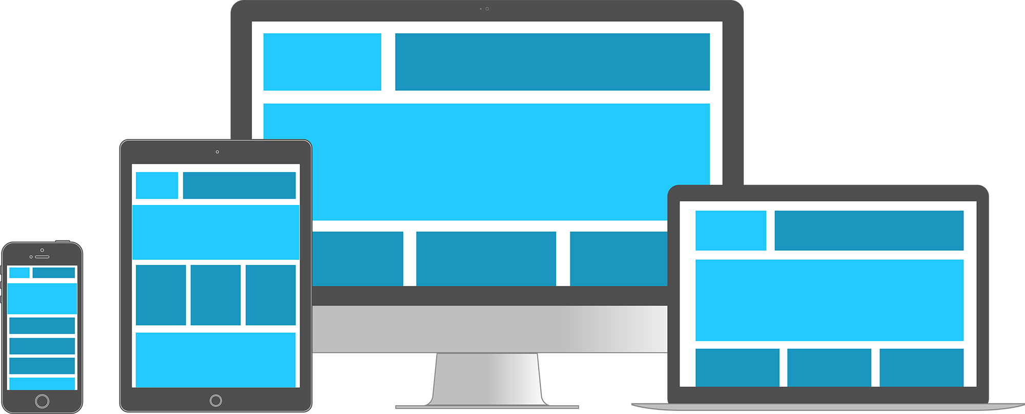
The display should be designed for a variety of media so that anyone can access it.
But, if you read the very first proposal of CSS, there is also something very remarkable that appears.
Current browsers consider the computer screen to be the primary presentation target, but [CSS] has the potential of supporting many output media, e.g. paper , speech and braille.
Here: "Current browsers consider the computer screen to be the primary presentation target, but [CSS] has the potential of supporting many output media, **paper**, speech and braille."
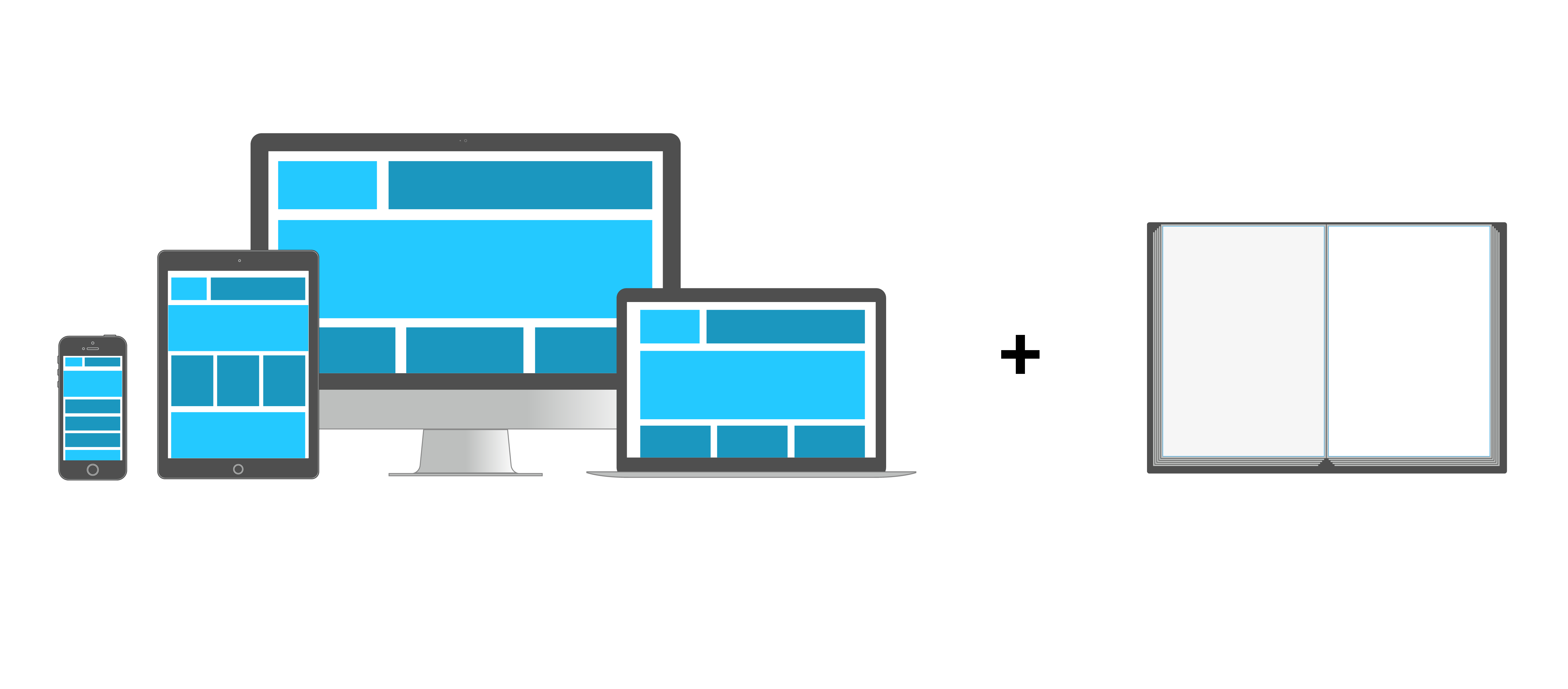
Responsive design = screen + print + ...
@media print{...}
Since the beginning of the web, there is a media queries that allows to target the paper outputs, or should I say, the paper displays of a web document. This is the @media print query
Creating PDF with the browser
SO, it means you can actually create PDF with the browser
On all web browsers, you have an option that allows you to print the web page. It’s here: File > print
A layout with pages is then generated, this is where your @media print styles are applied. And you can then, choose to print the document on your personal printer, but you can also choose to save this document in PDF format. This is where the book design begins actually
Open Source Publishing
Graphic design with free and open source softwares (F/LOSS)
And now, I want to talk about designers that change things: Open Source Publishing
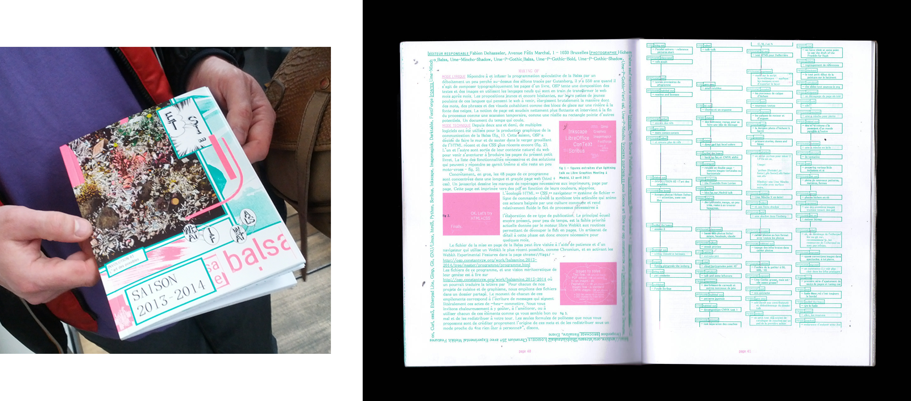
Program: La Balsamine, 2013–2014
Open Source Publishing
in two thousand and thirteen, they were the first graphic designers to use print features for the web and show that it was possible to use them to design print publications. And print publication that look good
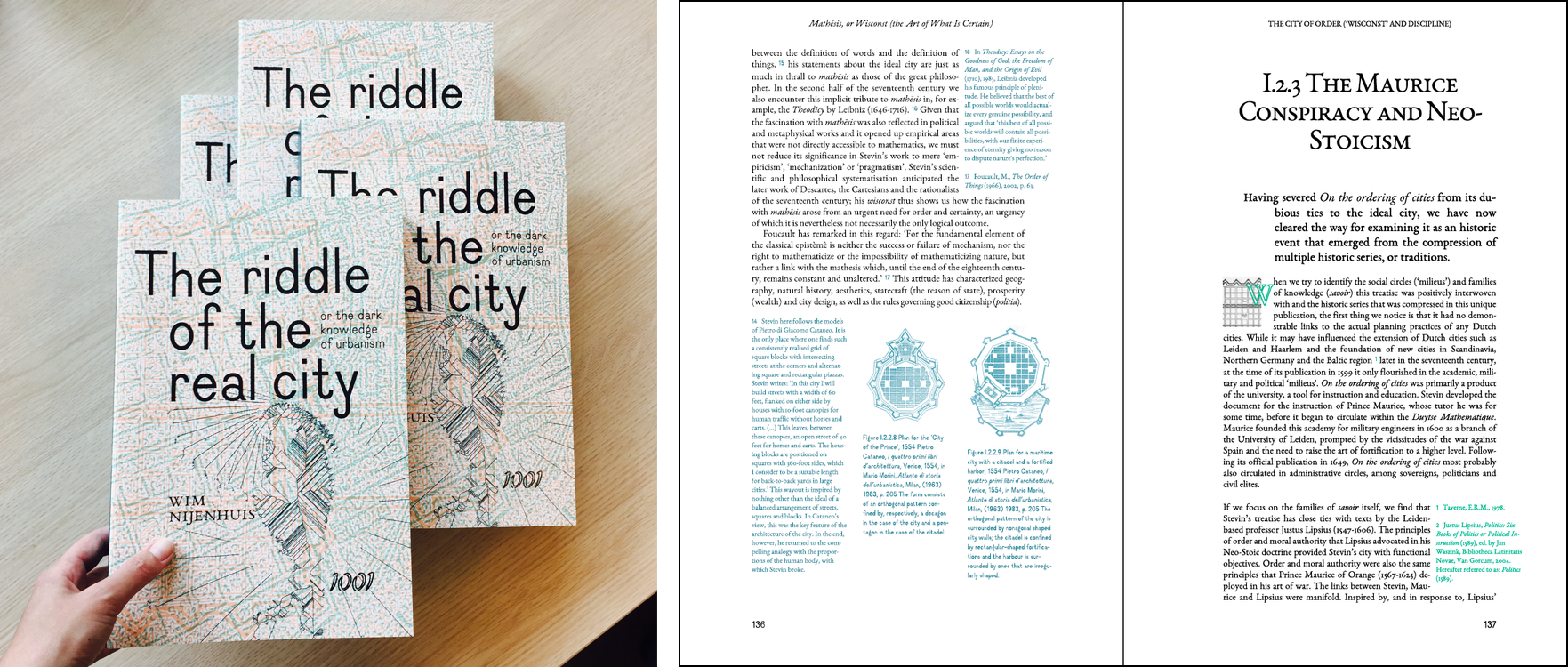
Book: Wim Nijenhuis The Riddle of the Real city , 2017
Open Source Publishing
After the conception of this program, they also made much more ambitious projects, like this beautiful book
Graphic experiments
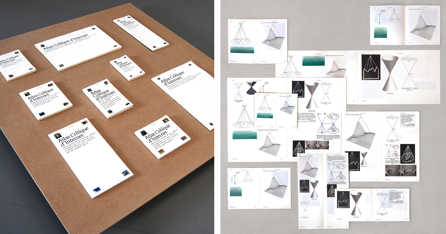
Louise Drulhe, Atlas critique d'internet , EnsAD, 2015
There have also been other interesting projects with css print, like this one. This is Louise Drulhe's graduation project. She made a very nice website that you can see online. But also, she programmed a print layout with web technologies where she takes the principles of responsive design for paper. Each time she printed a version of her site, she changed the size of the paper. With the CSS style sheets, the layout was adapted to the new paper size.
Performative publications
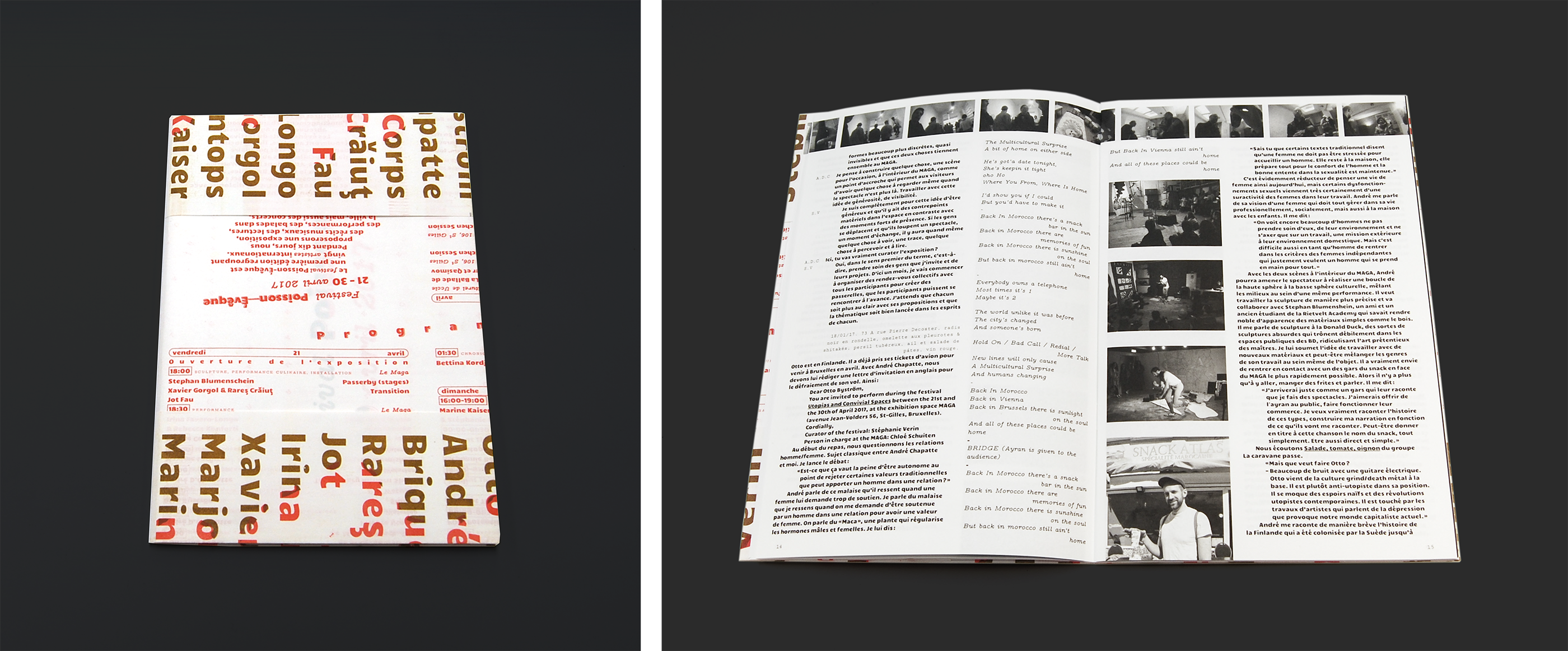
Stéphanie Vérin (éd.), Festival Poisson-Évêque. Conversation, documentation, restitution , 2017
An other one, made by Luuse. this is a booklet made for a festival in Belgium. During all the festival, they invited the participants to write on pad, it's an online collaborative text editor (like google doc but in free and open source). This is like a documentation of the festival. They took the content, transformed it into HTML and they could do the layout.
PrePostPrint
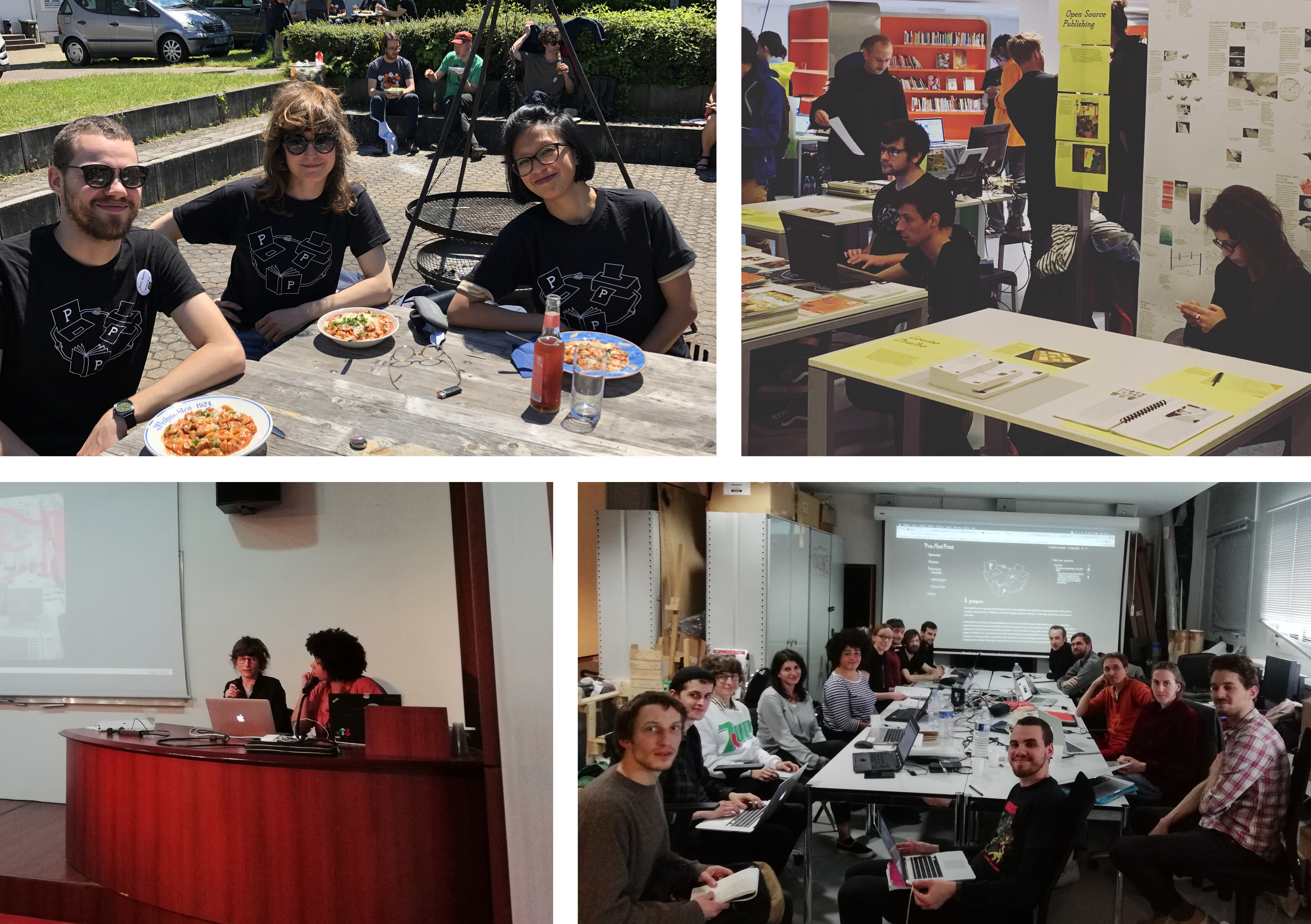
Gradually, there are more and more graphic designers who have started to work with alternative processes. And this is how, in two thousand and seventeen, SArah Garcin and Raphël Bastide founded PrePostPrint
Raphaël Bastide, Sarah Garcin, Open Source Publishing,
We have organized a few events, such as an independent publishing fair, conferences, workshops.
prepostprint.org
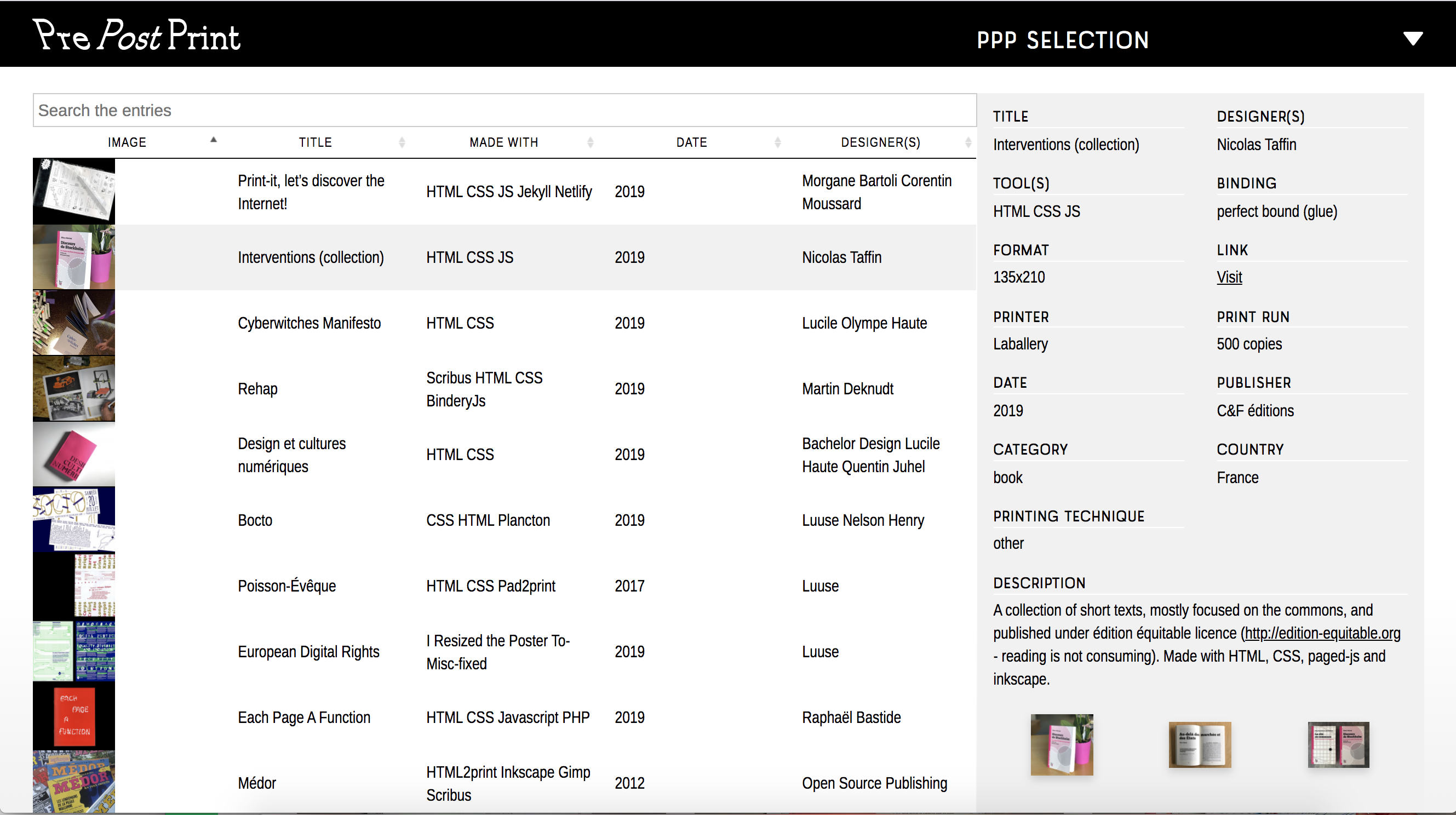
PrePostPrint highlights experimental publications made with free software.
Today, PrePostPrint is mostly a website where you can find a lot of resources about alternative publications. Actually, last October, there was a kind of PrepostPrint rewival in Rotterdam, from a publishing partyline organized by Varia.
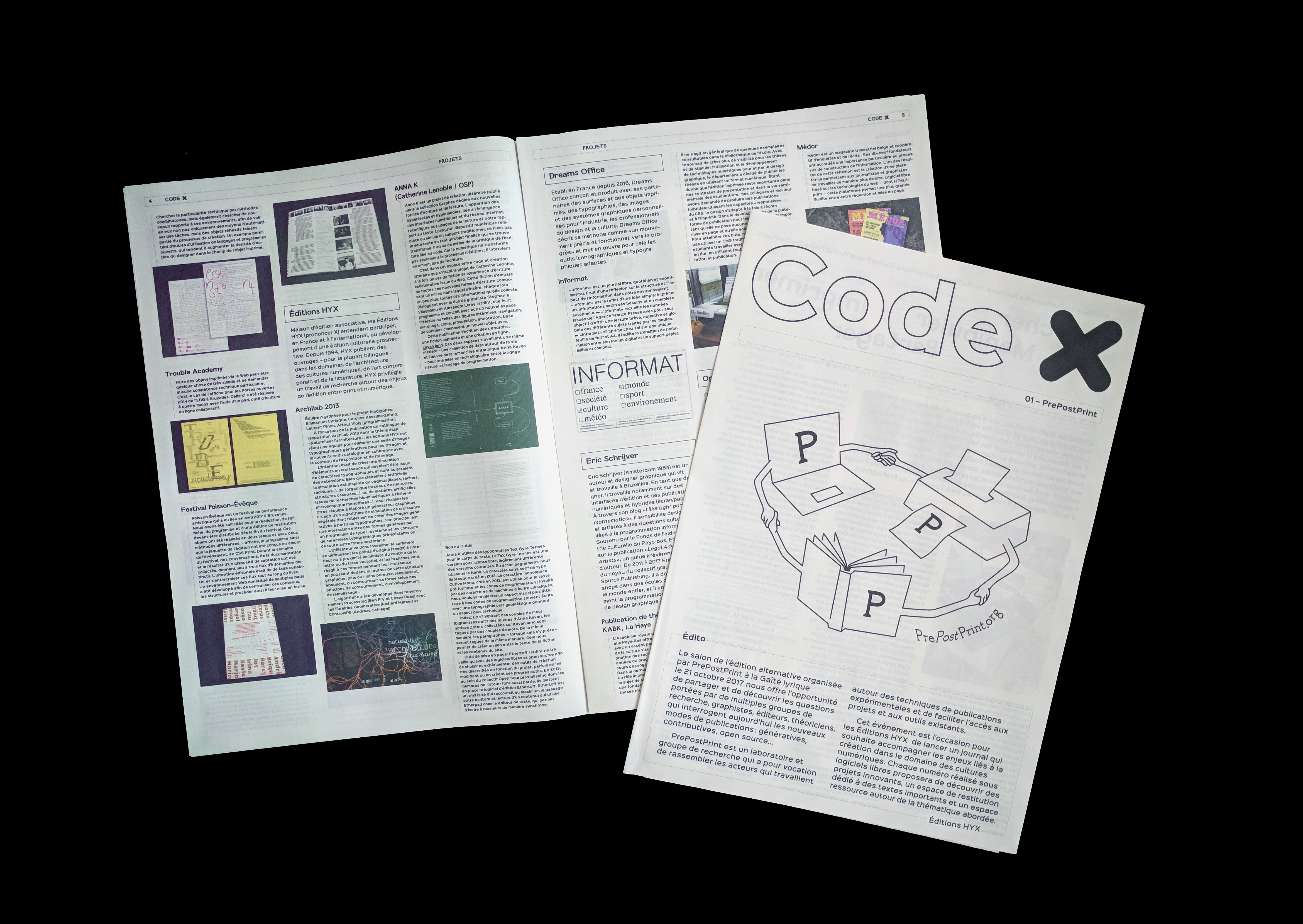
Code X, 01 — PrePostrint, éditions HYX, 2017
Also, during the independent publishing fair we had organized five years ago, there was this small publication printed with different resources on alternative publishing processes. It's published by X and you can find project presentations, texts and even a glossary.
Flux → Pagination
Because, besides all this, there are also more technical issues about using HTML and CSS to printed publication.
Missing features
Running headers, page number, facing pages, page float, etc.
In web browsers, some features are missing because Web is not mainly design for the print. For example, you need to control when and where your content needs a page break. You also need many specific elements used in printed layout: margins, running headers, page numbers, position elements in relation to the page, and so on
Main international standards organization for the World Wide Web
Let's go back to our little story of the web
I often use these two images to explain this. The W3C is the architects of the web, they make the plans, how the languages are written and how they should work. But then, it's the web browser constructors who actually build how the languages will be used in their browsers and what features will be available
So, if you look at CSS, is designed like that by W3C, in small modules call specifications. Each module is dedicated to a specific functionality. The features are improved little by little by updating the modules after long discussions to know what is the best syntax
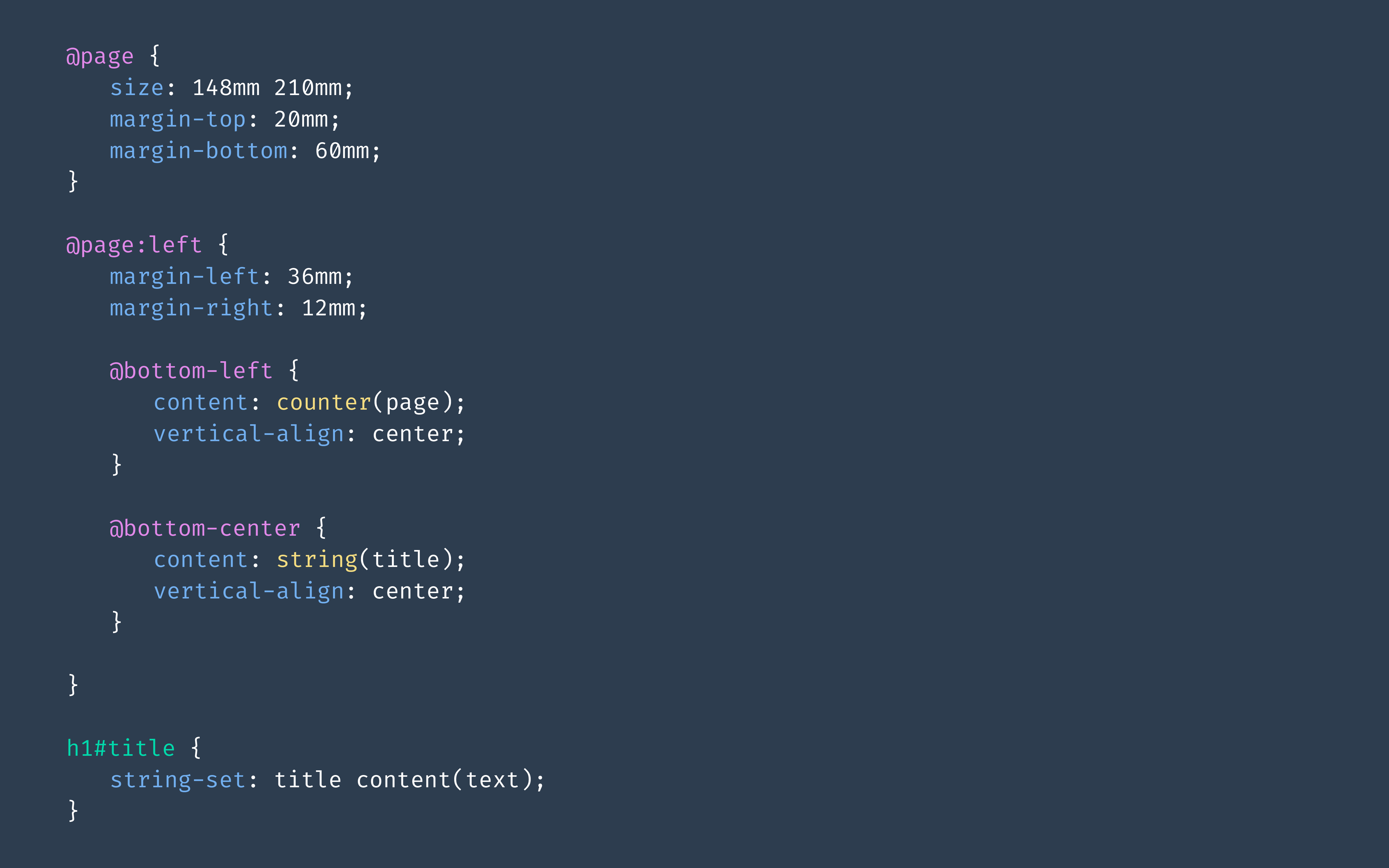
You see where I'm going with this. Here, there is module specifications called Paged Media et Generated content for paged media. And it ’s actually the CSS syntaxes we need for print. It’s red, it’s bad. browsers have not implemented these features.
In other words, the CSS you see on the screen is CSS that exists, that was written by the W3C to make printed layouts, but if you add it to your browser, nothing will happen.
A free and open source JavaScript library that paginates content in browser
to create PDF outputs of any HTML content
pagedjs.org
It's to answer these missing functionalities that we have developed Page.js, a javascript library to paginate content in the browser and to create PDF which will be printed books. And it"s based on W3C standards.
Core team
Adam Hyde
Fred Chasen
Julien Taquet
Julie Blanc
Coko Foundation
When I say "we", Here, is the core team of Paged.js. But it is a project that we want community-driven and we invite everyone to participate.
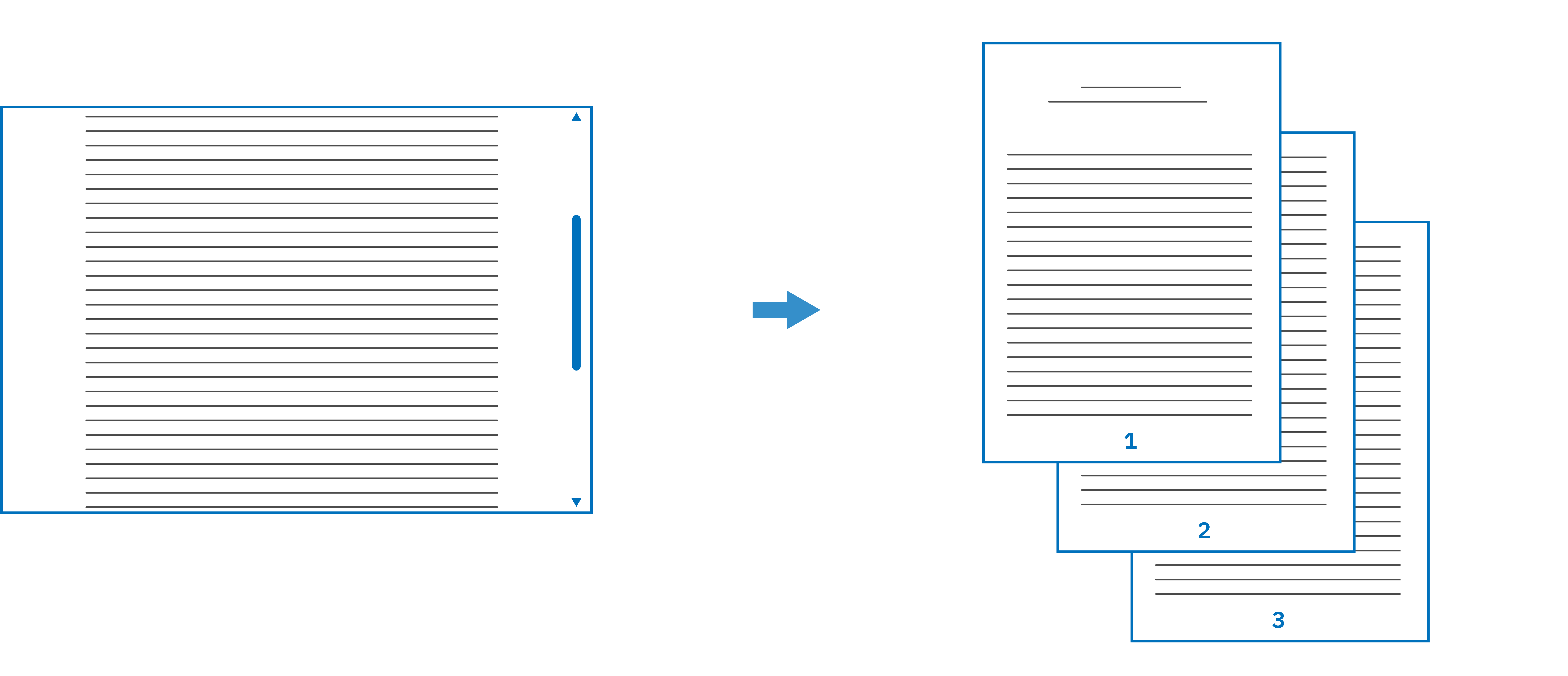
How does it work? Let's look at a web page with content
In your code you just add the script from PAged.js
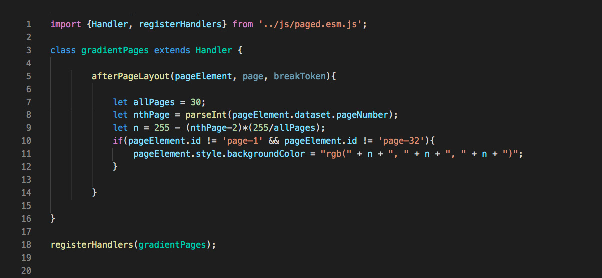
And here is the result of your web page, you now see a paginated visualization of the content and all the CSS dedicated to the functionalities for printing have been applied. Paged.js is what is called a polyfill: it supports CSS features that are not yet implemented in browsers to make them possible to use
Before showing you lots of things that can be done with Paged.js, I'm going to let this little video run, which shows how I code books, so you can see what it looks like
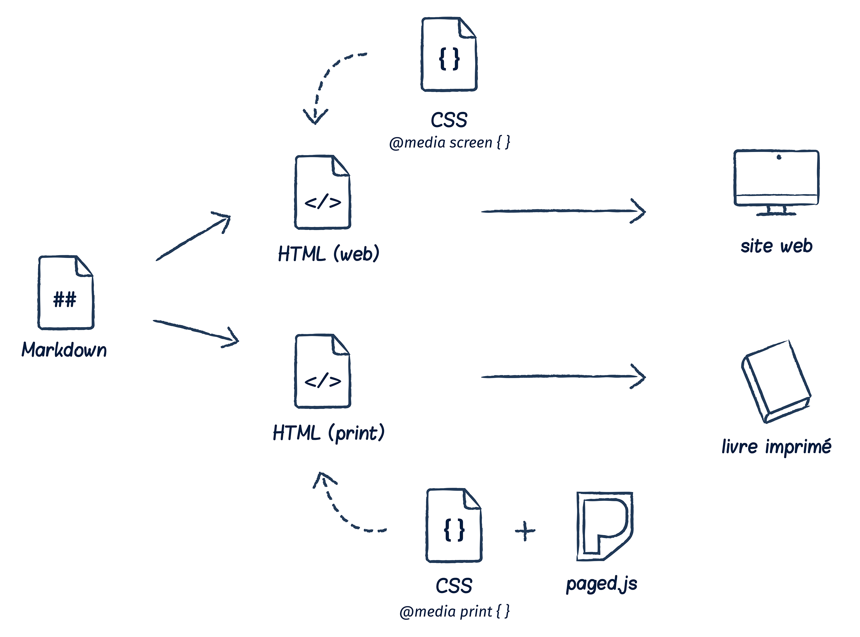
Single source publishing
Use the possibilities
Amélie Dumont, CityFab2.docs , 2020
CSS flexbox
Position and distribute flexible elements in a flexible space
the instruction was to create a web publication and a print publication of the same content and to find the specificities for each of the media.
As you see, for the printed version, Romane made the pages
Romane Poupelin
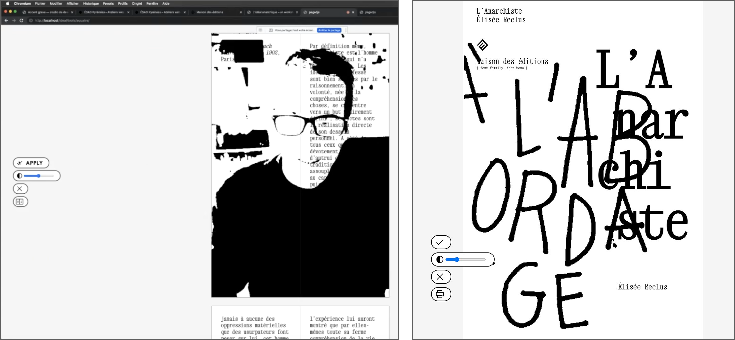
Workshop: L'idéal anarchique, November, 13th-18th, 2021
Use the camera to integrate background in images (Julien Bidoret)
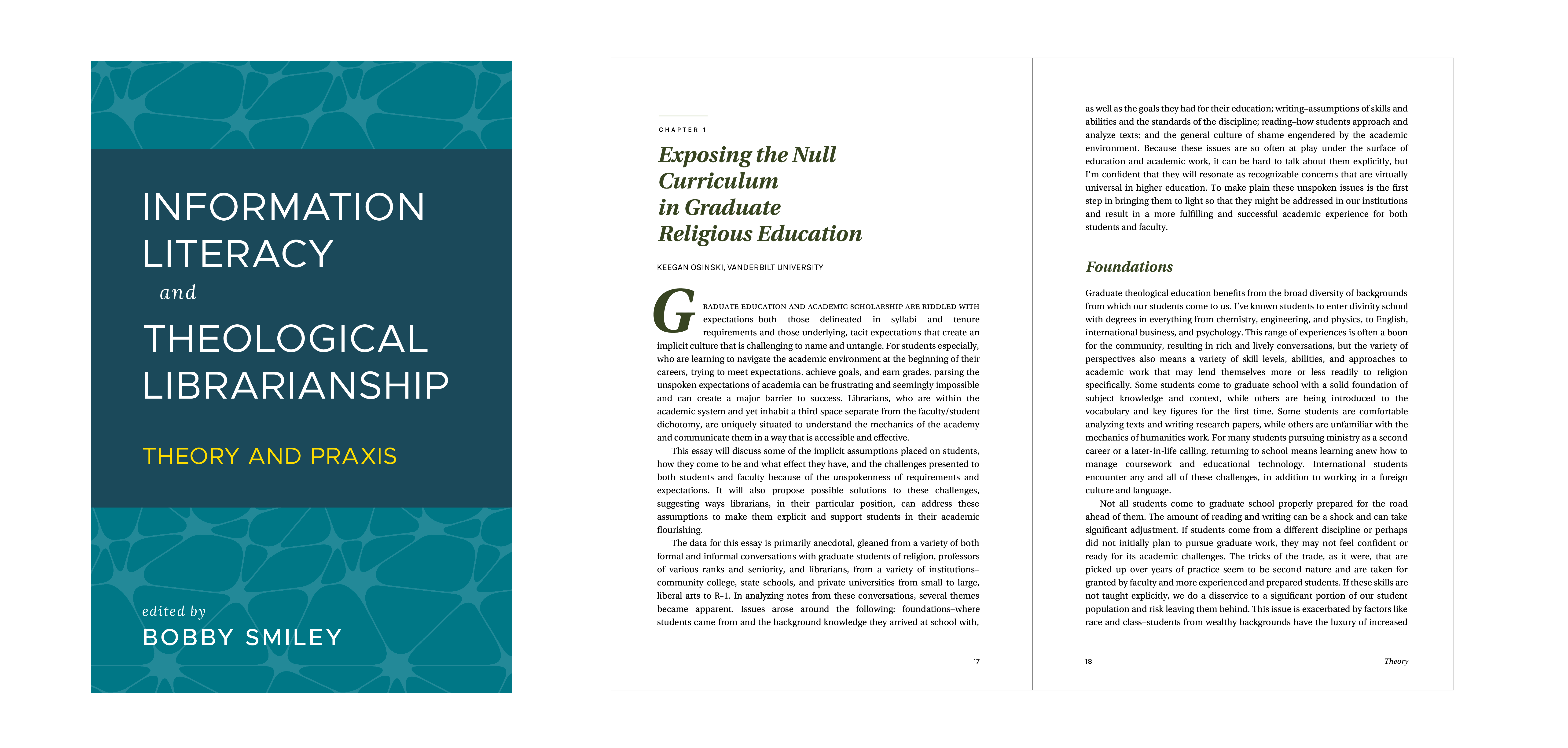
Atla Press Book
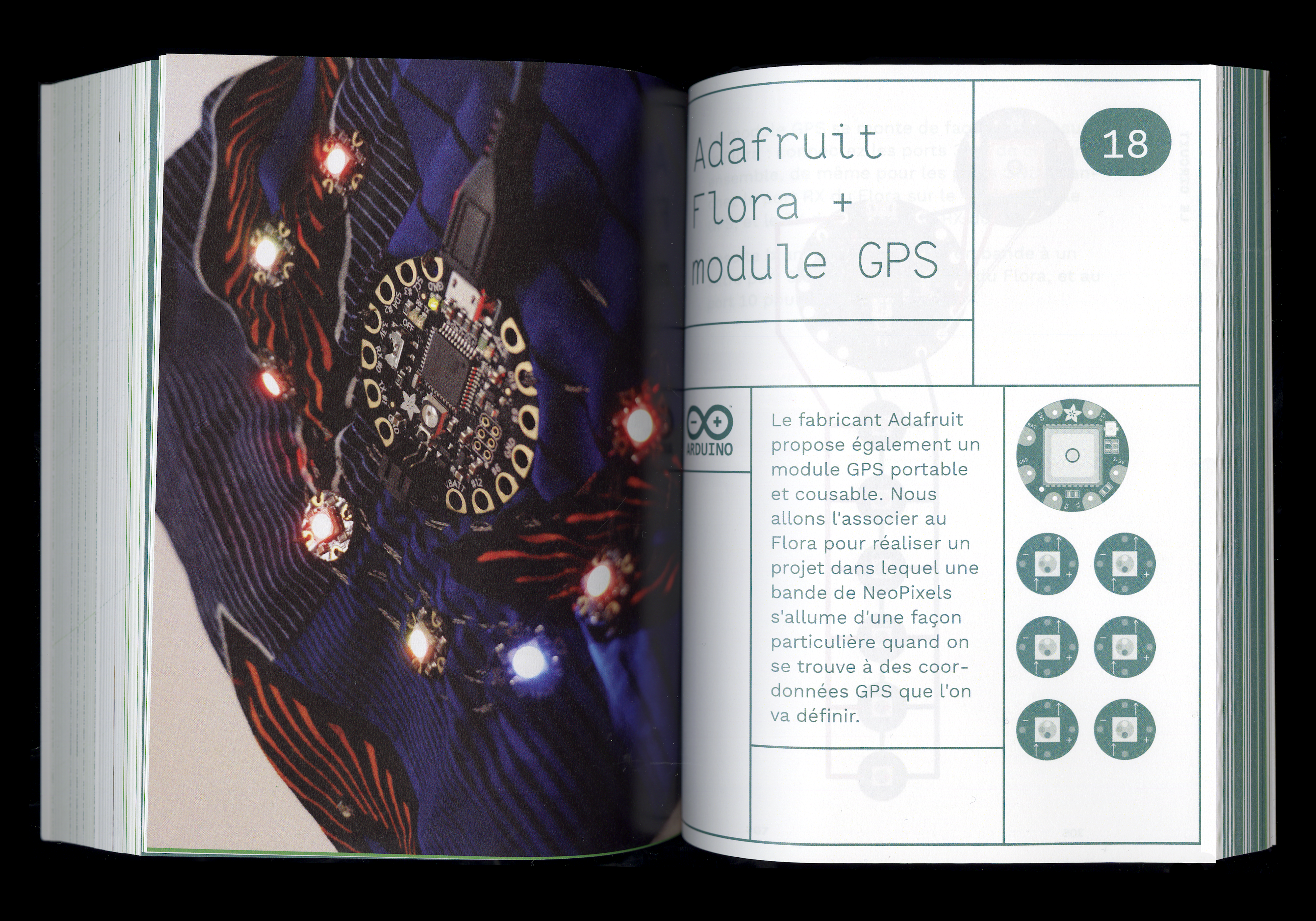
It's not only alternative practice in the world of graphic design but Paged.js is also use in publishing house. I think it's very important because we can't have adoption only from the graphics designers side, we need a bigger community to make things better
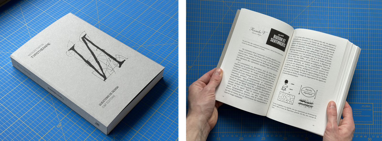
C&F éditions
Nicolas Taffin, Typothérapie , C&F éditions, 2023.
If tyou read French, this one is a realy good book about typographiy and publishing
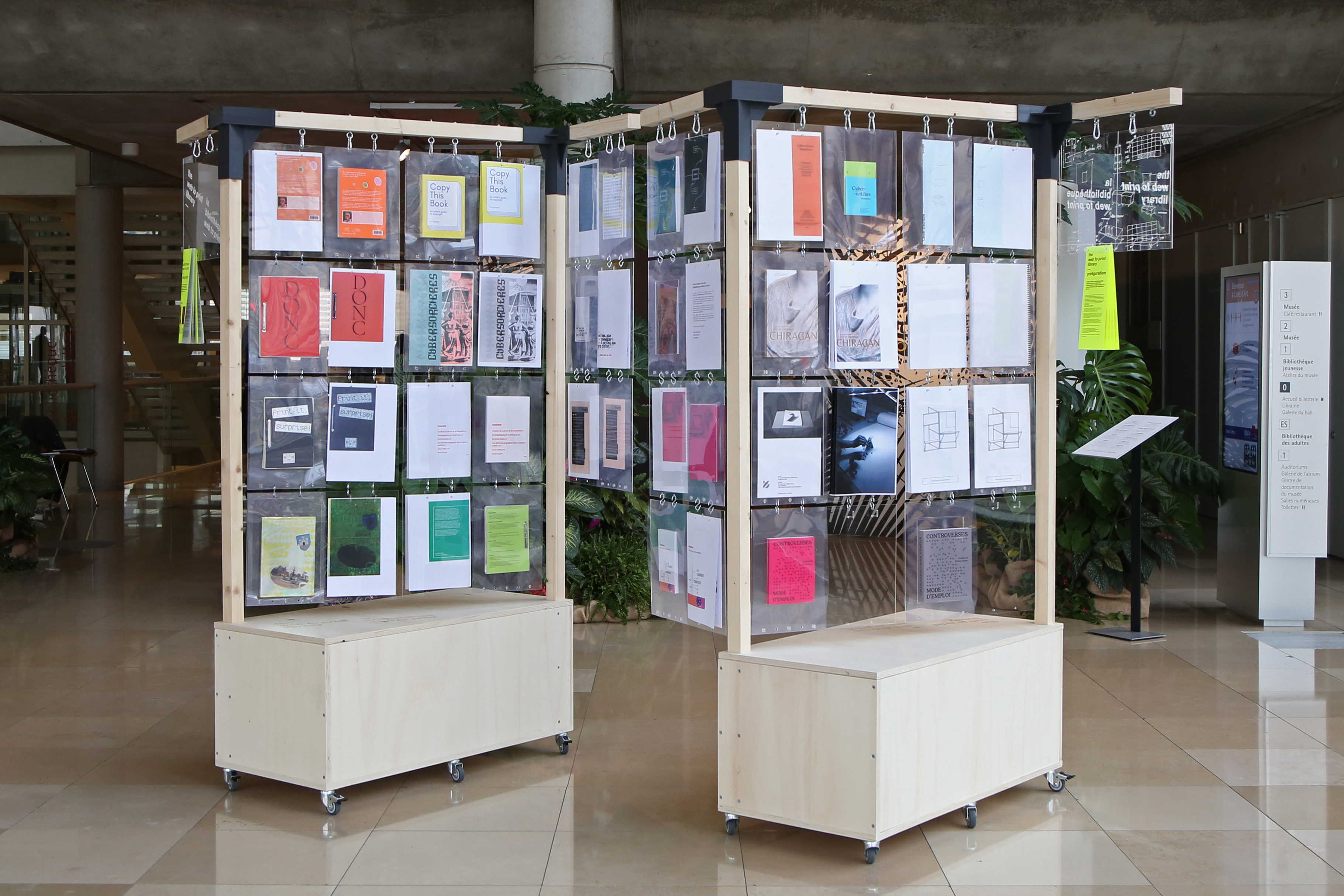
The web to print library (web.2print.org)
coordinated by Lucile Haute, with Quentin Juhel and Antoine Lefebvre
Thank you
Made width HTML & CSSslides.julie.blanc.fr
